2015, the year of the transformation
2015, the year of the transformation
What we are must resonate in how we appear. And in our daily communications and contributions, so that the brand remains coherent, a leader and a benchmark. For this reason, and on the basis that at ONA we have never stopped evolving in order to differentiate ourselves, in 2015 we decided to refocus the brand in terms of strategy, design and narrative with the aim of conveying what we are and what we do to the world in a meaningful and honest way. We transformed our image by opting for a timeless, simple and versatile logo that sought to communicate, at first sight, who and what we are. A typographic logo that conveys our cutting-edge nature, organically incorporating a minimalist lightning bolt and associating ONA directly with its activity: EDM.

This strategic evolution brought with it a change of tone, of message. We opted for a claim that acted as a declaration of intent for a new stage in our development: WE ARE EDM. A conceptual translation of our brand essence. A direct and transparent message that conveys what we believe in and what we are pioneers and experts in. Our raison d’être and the key to our success.
We thus created a brand represented by three key colours: red, anthracite grey and pure white. Personality, energy, purity, precision and technique described a new path for ONA. All accompanied by a clean, subtle and minimalist photographic style, which sought to maintain neutral tones, giving prominence to the product in an elegant and aesthetic way.
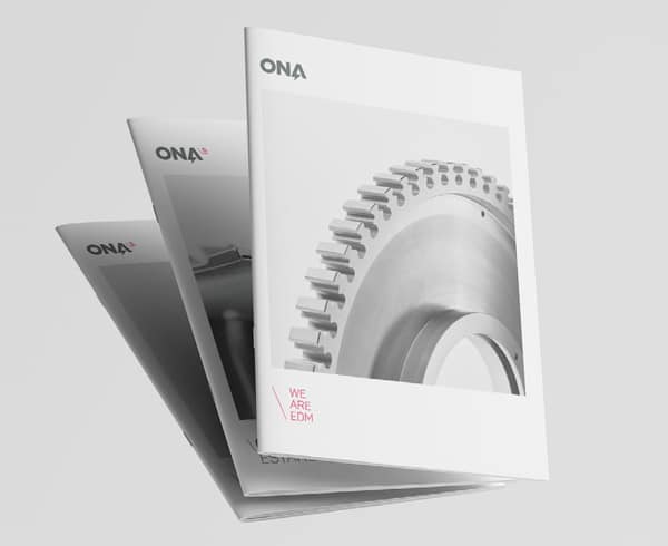
2015 marked the beginning of a new stage that opened up thousands of new opportunities for ONA and drove the brand to continue evolving, adapting and progressing, the business growing at the same time as we did. Embracing change and the adoption
\People \Technology \Profitability
